fig. 9
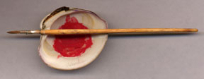
| I like to use & Newtonís Series 233 brushes. I blocked in the large areas with a ì0î size, laid in much of the rest with an old, junked up ì000î, and did the really fine detailed work with a ì00î, which was sharper at the point than the triple. These brushes have a good springiness, hold a point well, carry plenty of fluid, and the hairs are just right for drawing curved lines. Whatever brush you choose, those should be your main considerations. I also have a sable hair brush which I made by hand as it was done in the middle ages. This brush has a feather barrel for the ferrule, tied with fine wire, and a hand carved wooden handle. |
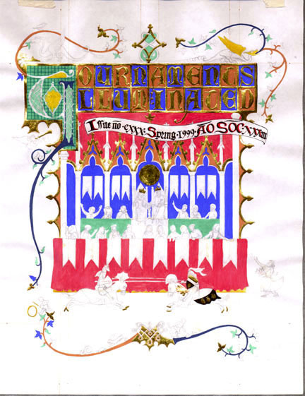
fig. 10
| I began
painting by blocking in the base colors. This
had to be done very carefully, because if you make too much of
the parchment wet at a time it will cockle up on you. Parchment
is made by stretching the skin and letting it dry, so if it gets
wet in a big area while being painted, it tends to change the
size and thus warp the page. Once the base colors were down, the
pattern designs which make the backdrops were painted. These intricate
designs called Diaper patterns are much easier to create than
they look. |
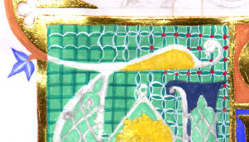
fig. 11
Note the tooled gold.
| After a medium tone is laid down, I use that fancy drawing board to mark a lightly penciled grid, which I then cover with a fine brush loaded with a very dark version of that same color. I freehand the lines over the pencil grid. The next step is usually some kind of light colored or white linework, and sometimes a circle or other element is added in a contrasting color. You just do it one element at a time. In the illustration above, the pigments seen are Fine ground Malachite for the field, verdigris for the grid, titanium white for the linework, and it is finished with dots of vermillion. Also seen here are Red Ochre, Orpiment, lightened Indigo, and lightened Ultramarine. |
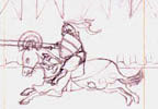
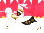
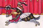
fig. 12
| Draperies on the curtains and garments of the figures were slightly modeled with a darker version of the base color. Part of this style includes adding black lines to accent the folds. The Figures were added after the backgrounds were completed so that the overlapping paints would clean up the edges. While most colors were laid in opaquely, there are a few which are done rather thin with water. This includes the slight wash of red ochre around the shadow areas of the faces. The area thus wet was not so much as to cockle the page. The columns were laid in with an overall tone of lampblack with white, and then dabbed with verdigris and terre vert mixed with white. |
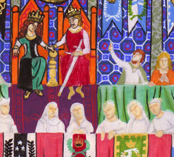
fig. 13
|
Colors used: Thrones: Minium. |
fig. 14
|
Lower vine: Coarse Azurite with White line ending in
Vermillion
leaf. In all, this project took almost
three weeks of full
time work. Much more if you consider the pigment manufacture and
time spent collecting shells, making tools, and doing research.
Considering the great number of mistakes I made and some of the
sloppy drawing, I do not consider this to be one of my best works.
All three of the weeks I worked on it I was rushed because of
having to finish by a particular time so I could get back to my
real job. If you know a better or more authentic method, I would love to hear from you. You can call or email at the contact address at the top of the website. Bibliography Anonymous. De Arte Illuminandi. Naples MS XII.E.27. New Haven: Yale University Press. 1993 Alexander, J.G.G. The Decorated Letter. New York: George Braziller Inc. 1978. ISBN 0-8076-0895-5 Backhouse, Janet. The Luttrell Psalter. London: The British Library. 1989. ISBN 0-7123-0176 Gould, Karen. The Psalter and Hours of Yolande of Soissons. Cambridge, MA: The Medieval Academy of America. 1978. ISBN 910956-64-2 Marks, Richard and Nigel Morgan. The Golden Age of English Manuscript Painting 1200-1500. New York: George Braziller inc. 1981. ISBN 0-8076-0972-2 |