
|
This
page is a visual description of the first stages of making
a contemporary Book of Ecclesiastes in an authentic medieval manner.
The materials, techniques, layout, and style are all those used
in early 8th century Northumbria. In fact, the book is essentially
modeled on the Lindisfarne Gospels created about 720 A.D. This
book is being produced for a private client, Dr. Jeroan Allison.
The book is bound in oak covered with chamois in 3-dimensional relief
using a Carolingian binding method. It stands 10 inches tall.
I am also currently writing a book on how to make a medieval book, entitled: Secrets Of Forgotten Masters: A 21st Century Artist's Exploration of how books were made in the Middle Ages. That book will be a comprehensive visual exploration of the materials and techniques used by medieval artists and craftsmen to produce entire books. It will feature sections on tool making, materials collection and manufacture, color making, and binding. Each section will be fully illustrated with photographs. The information will be documented from extant sources and treatises from the medieval period. |
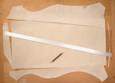
| I have started with sheep skin parchment. Although the book I am writing will show sheep skin being processed into parchment from the raw flayed hide (see that here), this material was purchased. The first step is to determine the size of each bifolia (a bifolium is the single sheet of material which is folded in half to make four writing pages). I settled on 15 1/2" wide by 10 1/4" high to account for trimming during the binding stage of making the book. At this size, each sheep skin was able to yield 3 bifolia, so 12 pages. These were the largest sheep skins I could get, and I had to return a couple for not being quite large enough. |
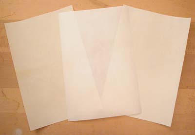
| After cutting, there are three bifolia, and as you see the flesh side is whiter than the hair side, which is more tan. They are semi translucent. |
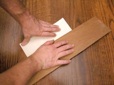
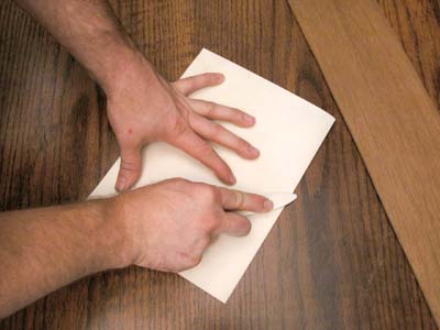
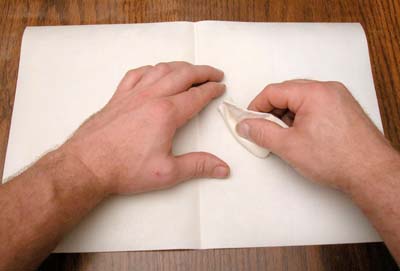
| Each bifolia must be folded in half. This was done by placing a board over the area to be folded and being very careful not to allow the pages to slip, the board is gently pressed down from edge side to fold side. |
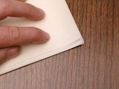
| The bifolia are then stacked and nested into each other. It is best to place the thinner parchment on the inside of the quire (a quire is a gathering of bifolia, in this case 4 bifolia nested together). When the bifolia are nested, the edges of the center pages will protrude from the outer pages. This will be trimmed in the binding process. |
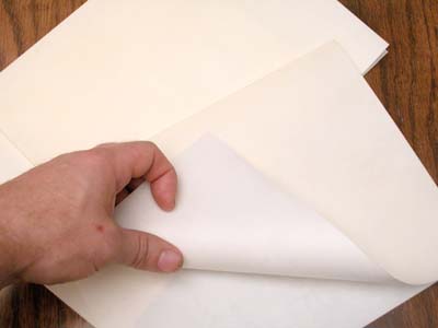
| Notice the slight color differences between the white flesh side and the creamy tan hair side of the skin. Usually in the middle ages a flesh side faced a flesh side and a hair side faced a hair side when the bifolia were stacked. However, Insular manuscripts did not follow this. In this case, it was appropriate to stack my quires with the hair side facing out and the rest of the stack oriented the same way. |
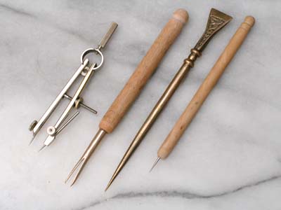
| These
are some of the tools used to prick the guide
marks and to draw the ruling lines for the calligraphy. On the
right is an awl of wood with a steel point. A strong metal must
be used because the point must be thin enough to be able to penetrate
8 layers of parchment without sticking or breaking. It is unlikely
that a knife point would work for this, and although it could
be used as a wax tablet writing stylus like the bronze example
to its left, you will notice that unlike the tablet writing stylus,
it has a round top. This is because the round top is pressed by
the palm of the hand to force the point through the parchment
stack. The tablet writing stylus has a flat top which is used
to erase the writing in a waxed tablet by wiping the letters flat
into the wax. This difference is how you know which tool is which.
The tool to the left of the stylus is a bronze fork divider and
is a conjectural tool. The writing lines of the Lindisfarne Gospels
were incredibly even, despite there not being a set of ruling
guide holes. My experience shows me that on a small scale, it
is not reasonable to expect perfect accuracy when lining up by
pricked holes with a straight edge, so having a fork divide with
a uniform set spread is the best way to ensure a consistent letter
height through the entire book. However, we do see medieval book
paintings depicting dividers similar to the modern one on the
left. I used these to scribe the vertical column guides. I make and
sell these and other kinds of tools. |
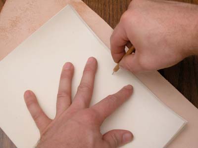
| This is the method of pricking the holes that will be used to align the straight edge for scribing in the vertical column guides and horizontal letter rulings. |
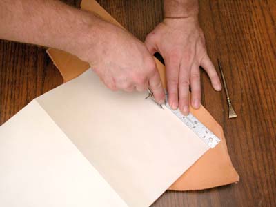
| The divider is being used to scribe the creases of the vertical column lines. Note the thick leather pad used to allow the parchment to crease. With a lot of pressure and sometimes going over it twice, the lines are also visible on the other side of the page. |
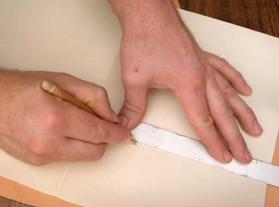
| The horizontal ruling of the text lines is applied in the same manner, using the fork. They span only the column bounds, not traveling across the whole page or bifolium. |
| Before writing, both sides of the skin must be prepared. Normally the hair side will be harder and less penetrable by ink and paint. The hair side was sanded hard with fine sand paper. In the middle ages it would have been rubbed down with a powder of pumice rock, which did the same job and could help remove any extra grease. being contrary in its nature, the flesh side is usually very absorbent and ink can bleed into the fibers. To counter this, gum sandarac crystals are powdered fine and put into a loosely woven bag. This is "pounced" onto the page to deliver a controlled amount of sandarac dust. I then rub this into the fibers with the cloth of the bag to be sure the right amount has been applied. The remainder is wiped away with a rag or if there is a lot, it is first flicked off by tapping the reverse side of the parchment with my finger. |
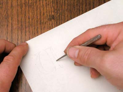
| The large decorated letters that will open each chapter must have room given to them by the calligrapher. To plan where the text will wrap around them I first indicate their positions with a light drawing using a lead/tin alloy stylus made according to medieval directions. It writes like a 2h pencil on the prepared parchment. |
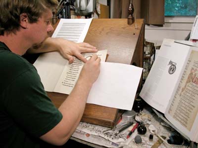
| This is my writing slope. The slope helps me use the pen with the best body mechanics. My ink bottle is on the table to the right. The ink is a combination of encaustum (oak gall ink) and atramentum (bone black pigment) as was used in Insular manuscripts of this period. My exemplar of latin is taped to the upper left. I use a sheet of paper to prevent my arm and hand from depositing skin oil on the page. Such oil, even in the slightest amount, will prevent the ink from writing. |
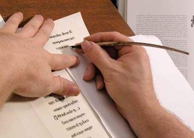
| This close-up shows the right way to hold the quill for medieval scripts in general. You don't really appreciate the reasons they held it this way until you try it. Notice that my middle finger is used as a brace to prevent my point from wiggling. I use only a "feather" touch to make the lines, and the same with the bracing of that finger. The whole hand slides on the page more by arm movement than by finger movement. This creates straight, even lines and allows all types of pen manipulation. Instead of always using the fingers to rotate the tip, the elbow swings out to set up some rotations. The rotation of the tip angle changes the width of the stroke. This method is far more stable than using a modern pen technique. |
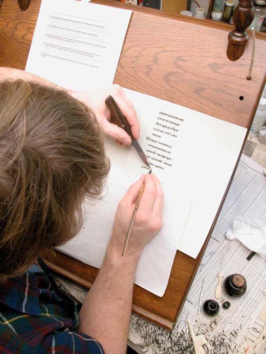
| Here
we see the proper way tohold the pen, the pen
knife, the parchment, and the paper which is used to protect the
parchment from skin oil. Notice that I am working both in front
of my shoulder AND with my eye looking mostly straight down on
the pen strokes. This helps to ensure true verticals. I have better,
more accurate tools these days, but the principle is the same. |
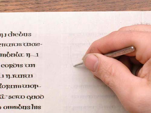
| This
is the reproduction lead/tin stylus being used
to draw the light and fine metalpoint outlines of the initials
before they are illuminated. I have these lead/tin styli available on
my Store Page. |
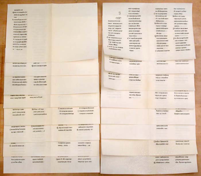
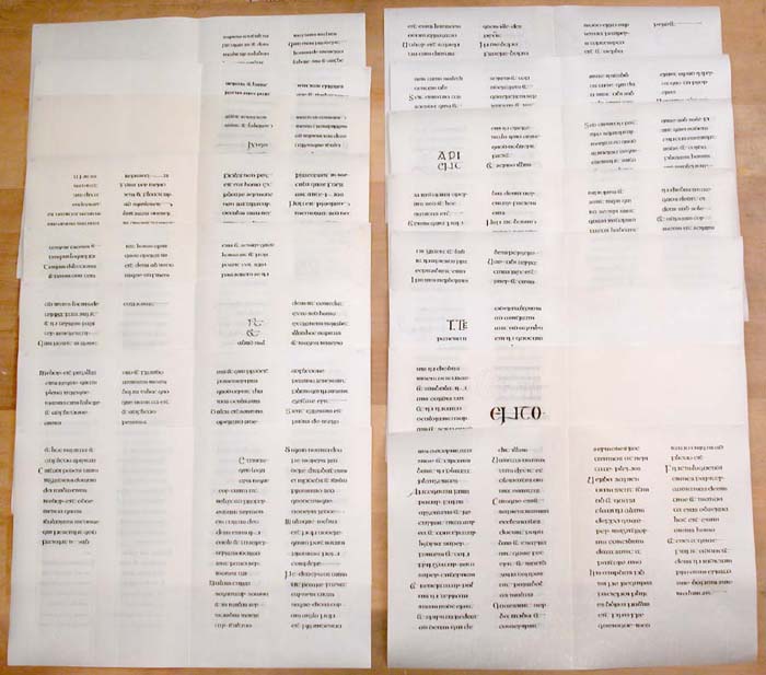
| Four Quires of bifolia written out in the Insular Majuscule hand of early 8th century Northumbria. Each quire is a gathering of sixteen pages. These are the tan colored hair sides of the parchments. |
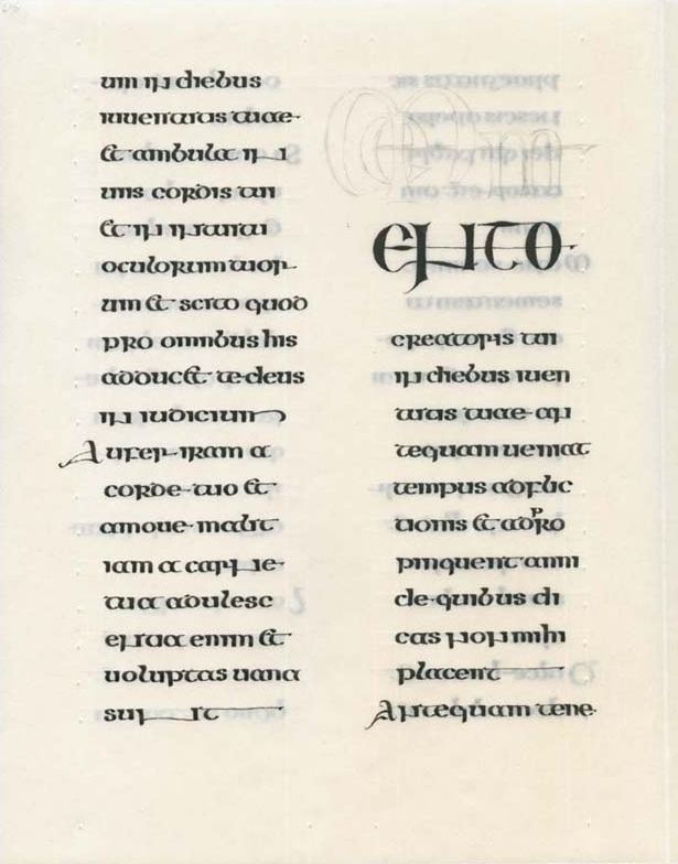
| This is a sample of a page of calligraphy showing the ruling lines and text. There will be some minor decoration of the large letters starting each verse. |