|
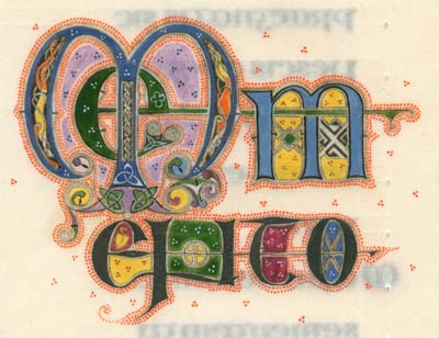
My version of the Ecclesiastes manuscript was created
in the style of a Gospels book and primarily based on the Northumbrian
Lindisfarne Gospels. Obviously, this meant a deviation from such
an Old Testament format. The client also requested a few other
minor differences. The Cross configuration was abandoned, the
predominant yellow of Orpiment and red of Red Lead color scheme
was changed to a blue and green dominance. The client also requested
that the illustration feature his pet beagle. |
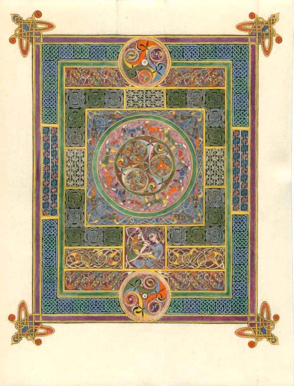
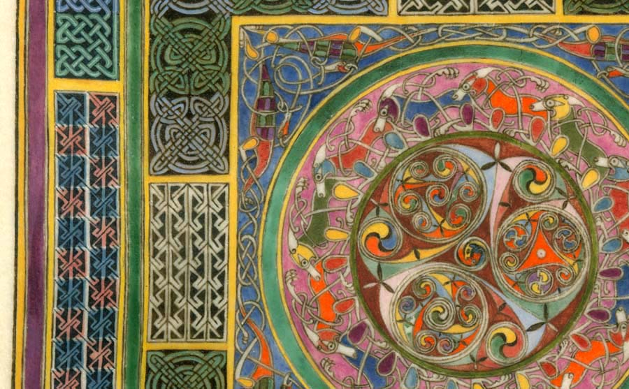
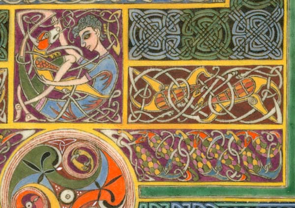
| A Gospel book of this tradition (and remember, this non-Gospel book is based on a gospel book) would begin with a fancy full page illustration called a Carpet Page. This one in particular relates to the medieval sense that the world is in the center of all things and is surrounded above by sky and aside by water. And so I have set the complexity of earth in the center disk and populated it with dogs in tribute to the client's wish to feature his pet, but also to represent the creatures that walk the earth. Beyond the green ring of Verdigris is a sky made from crushed lapis lazuli, a stone that was of mysterious origin and brought from a place beyond the seas (Afghanistan). I have used it as a metaphor for sky and populated this panel with Griffins. The outer knotwork panels represent the waves of water and the endless river/ocean surrounding the world. Fretwork, knots, and key patterns are minute and intricate in hopes of distracting evil spirits away from the center spirals of life. |
| Notice the fine ink lines between colors, especially the purple and yellow border line and the spirals. These are almost too hard to see with the naked eye on the original. |
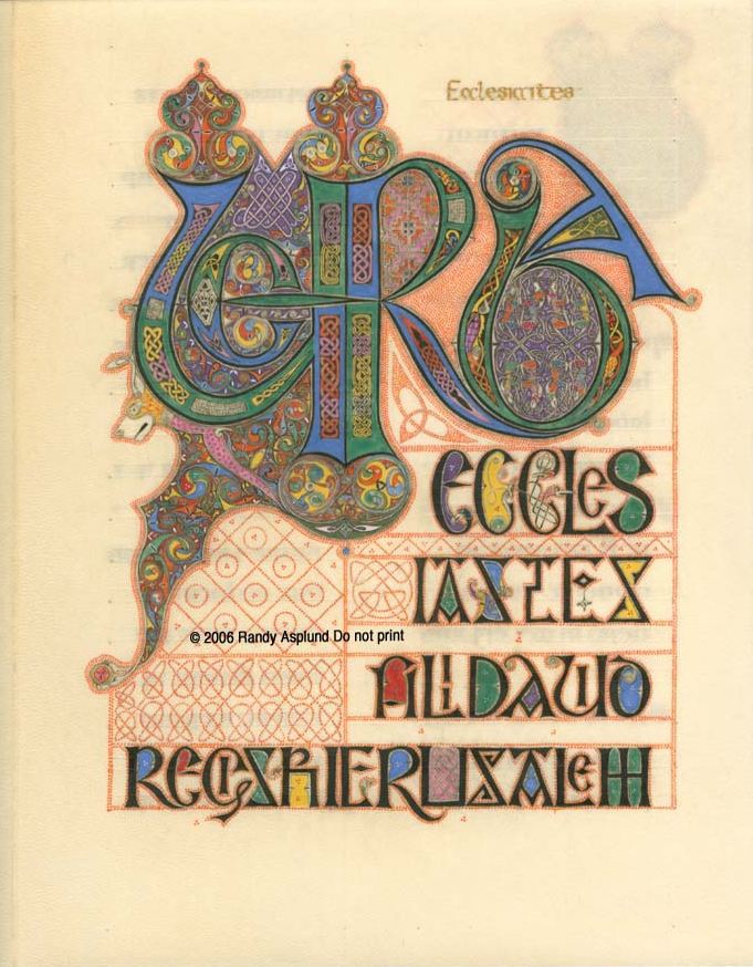
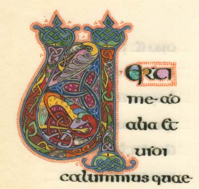
The Incipit Page
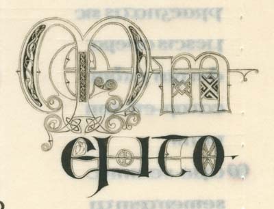
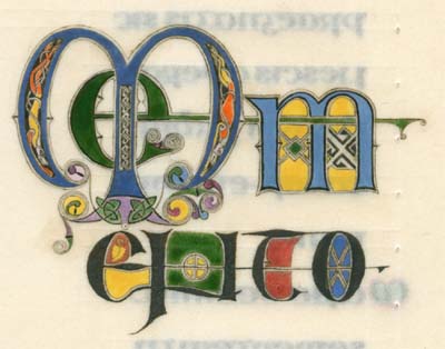
| Following the Carpet Page we come to the Incipit Page, meaning the beginning of the text of the book. The only use of gold in the book is the title "Ecclesiastes" written near the top in genuine gold ink. The text reads |
VERBA
Eccles
iastes
Filii David
Regis Hierusalem
| After designing the art on a waxed tablet, the medieval artist would perfect the designs on another parchment. Then the design would be drawn out with a metal point of lead and tin alloy, and in other places using a drypoint stylus which leaves only a scored line. The next step, which you see here above was to use oak gall ink to make a water resistant and permanent line. This was also used in some places for background fill. |
| Next, the colors would be blocked in with small brushes made from miniver hairs set into feather barrels and attached to wooden handles. |
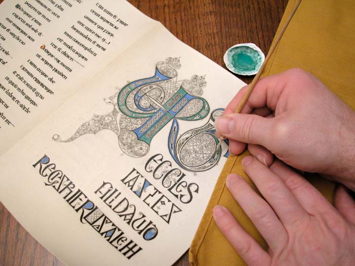
Blocking the Incipit page with a handmade brush.
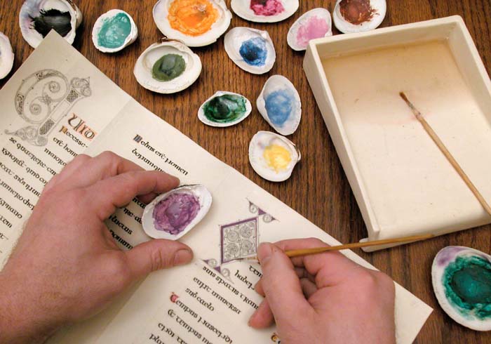
Blocking the Letter "O" major initial opening chapter 3. Notice that the colors are kept in clam shells and used one at a time.
| The final elements are laid on top of the blocked in colors. In the Lindisfarne Gospels it was common to ouline all but the very smallest of decorative objects and then fill colors next to colors rather than one on top of the other. The exceptions were dots and thin line motifs such as line width triskels. |
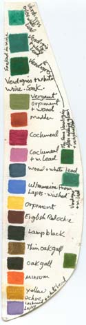 |
The pigments of this time and place came from minerals, plants, insects, and animals. To the left is a partial sampling of the colors used in Insular manuscripts. In addition to this list were white lead and white made from chalk or calcined bones, and yellow made from the galls of oxen or fish. Three colors here are medieval, but NOT used on Insular manuscripts. Cochineal insects, which are similar to the Kermes insects of the Mediterranean, were substituted because Kermes are currently unavailable. I made some Madder root lake to replace Folium Rubeum, which is made from the Turnsole plant (chrozophora tinctoria), because Turnsole is not available. I am working on getting these and other rare pigment sources for future work and inclusion in my book. Lapis comes along later than the Lindisfarne gospels. |
The pigments used in this Ecclesiastes are: White: Chalk and lead |
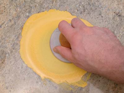
Most pigments need to be ground very fine. This is Yellow Arsenic Sulfide known as Orpiment being ground on a slab.
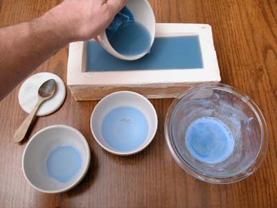
| Although Lapis Lazuli was not used on the Lindisfarne Gospels, I had read information to the contrary at the time I made this book. So I made lapis Ultramarine Blue using a later medieval recipe. Here we see the Lapis Lazuli after being ground fine. It has been washed to separate the calcite and pyrite impurities. The color water is then poured into a hollowed brick in order to draw out the bulk of the water. This is the technique used for use on other books at the time the Lindisfarne Gospels was made. Later medieval processing of Lapis was better and created a darker blue. As paint, this color will look more like the wet material inside the bowl above the brick than the dry powder in the bowls at the bottom of the picture. |
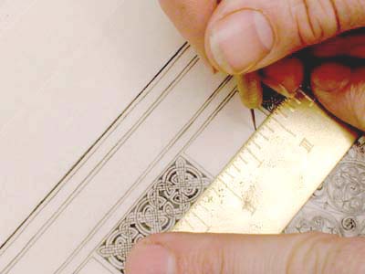
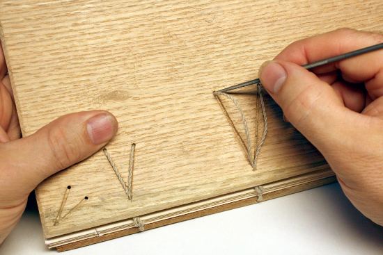
| Knots, Step patterns, and Key patterns all had to be laid out with careful pricking (seen here), and ruler drawn lines. Some lines were drawn with a lead/tin stylus which made marks similar to our graphite pencils, while other lines were made by scoring with a metal stylus that leaves no color, just a shallow furrow. |
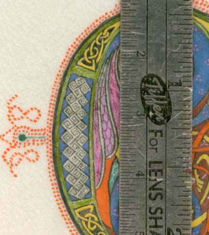
| The scale on this ruler is in centimeters on the left. The increments are 1/2 mm.The square spirals along the left hand panel are about 1 mm along the right side. The red lead dots are made with a quill. |
Letter "V" for "VERTI"
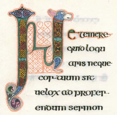
Letter "N"
| The 8th c. Carolingian type binding is on oak boards and sewn to hemp cords of a historically authentic thickness. The cords travel through hand carved chanels. |
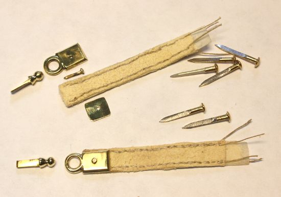
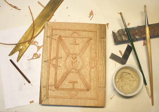
| The structure under the chamois covering is influenced by the raised relief of the 7th century Stonyhurst Gospel (aka the St. Cuthbert Gospels of St. John) |
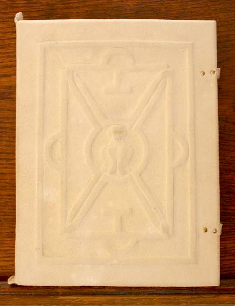
The final cover is soft chamois leather over oak boards
Back To
Making Ecclesiastes p.1